Regenerative Ag Verification 101 Pathway:
How Remotely Sensed Performance Zone Maps Improve Agriculture Assessments
By Pankaj Bhambhani
Understanding how farmland behaves is tricky because it’s not just about historical yield, type of soil and weather conditions. We often think of a field as a single unit, but in reality, every field has variability: differences in soil type, texture, and slope mean that different parts of the field show obvious differences in yield. To deeply understand a field, we need to know how these parts perform relative to each other.
Farmers and land operators are familiar with all the intricacies of every field they cultivate. But for anyone else (such as a potential buyer or leasor), detailed information can be hard to find. However, when assessing a parcel’s potential, having this detailed information is much more valuable than simply knowing the historical yield. Is there no hope then, to assess an unfamiliar parcel of land without investing years in it? At CIBO, we think we have a solution. Our technology relies on state of the art machine learning and computer vision. The proprietary algorithm uses remotely sensed imagery to provide a detailed map showing the relative performance of different regions within a parcel. We call this a Performance Zones map. The algorithm also produces a score that helps compare this information across parcels. We call this a Stability Score.
Below we show a performance zones map and stability score for an example field in Iowa – which we will reference throughout this blog as “John Doe’s field”.
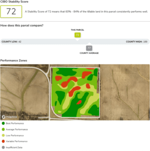
A Performance Zones map is a way to break up a parcel of farmland into different zones based on historical productivity. There are usually four major zones, namely Best Performance, Average Performance, Low Performance and Varying Performance. Sometimes an additional zone named Insufficient Data indicates that there wasn’t enough historical data available to reliably place the underlying portion of land into one of the four zones.
Land operators often use the performance zones map for their land as a validation tool, comparing its conclusions against their personal assessment of the field. But perhaps the biggest benefit of this product is the insight it provides for new, unfamiliar fields. We might estimate the risk associated with farming a new piece of farmland by looking at its performance zones map – in particular the regions of low and varying performance. This risk is quantified by CIBO Stability Score, which tells us what fraction of the field does not have low or varying performance. A higher stability score means that a smaller percentage of the land has low or varying performance, hence the risk of farming that land is lower. Finally, we note that in addition to telling us the risk, these regions of low and varying performance also represent opportunities for improving land productivity, perhaps through a change in management practices.
Given that a performance zones map is generated at the field-level (as opposed to the county- or state-level), it is natural to ask why we aren’t using yield information from combine harvesters. After all, not only is it the best resolution data you can get for an individual field, but yield is the most direct measure of land performance. However, yield information is not publicly available, and manually collecting this data by reaching out to farmers across the US would be prohibitively expensive, even if farmers were willing to share it. Furthermore, yield data can be very noisy. Examples of noise include overlapping polygons of data as the combine makes multiple passes over the field, and faulty sensor measurements. The process of cleaning and analyzing Combine yield data is as much of an art as science and is difficult to automate. Therefore doing this for every field in the US is a daunting task.
Fortunately, remote-sensing provides a promising alternative to combine yield. Satellites such as Landsat [1] and Sentinel [2] provide global coverage and free access to their image data. These images have a lower resolution compared to combine yield (one Landsat pixel corresponds to a 30m x 30m wide region on the ground), but they usually are not as messy as yield data (although they are not free from problems, see the section on Challenges and Future Improvements’ for more details).
At this point, you may ask a completely valid question: how can satellites possibly measure yield from up above the world so high? Well, they don’t, at least not directly. But they take images of the surface underneath in various bands (including thermal, infra-red and the visible bands red, green, blue). And scientists have devised metrics to approximate yield using the different satellite band images. One such widely used set of metrics is a Vegetation Index [3] – abbreviated as VI. A vegetation index typically ranges from -1 to 1 and indicates the amount of vegetation growing on the surface. These VI images, derived from the raw satellite data, are more useful for analysis than the original images themselves and are what we use to compute a Performance Zones map.
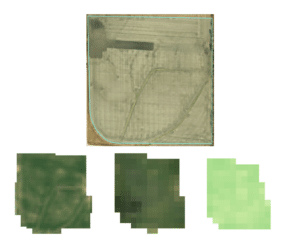
Top row: a high-resolution image of the field as provided by Esri and Earthstar Geographics (and rendered using Leaflet.js). These are not freely available and are only captured once every few months/years.
Bottom row, left: An image of the field captured by Sentinel on June 28, 2018. Sentinel satellite has decent resolution (5m), but has only been operational since 2016, so there is usually not enough years worth of Sentinel data to generate a Performance Zones map.
Bottom row, middle: Image captured by Landsat on the same date. Landsat has a resolution of 30m, but they have images dating back to 2006, which makes them a good choice for generating our maps.
Bottom row, right: VI image of the field on the same date, as derived from Landsat data. Higher values are shown by greener pixels.
To obtain a Performance Zones map for a field like the one shown above, we would choose a number of these remotely-sensed VI images – typically one per growing season – and compare them to determine historical performance. To make the comparison meaningful, we try to remove the effects of planting dates and different crops. The former is accomplished by choosing images that show the crop at a similar growth stage during each season. For the latter effect, we note that for a given region within the field, we aren’t interested in its absolute performance but rather how high or low that performance is, relative to the field as a whole. We, therefore, devise a new metric that quantifies this relative performance of a region. We call it a relative score, defined as the difference between the VI value for that region and the average VI value for the field, normalized by the average field VI value. A positive relative score in a year means the corresponding region performed better than the field on average, in that year, a negative score means it did worse.
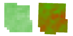
To assign a performance zone to each region, we look at how its relative scores have changed over seasons. Suppose there is too much variation in relative scores (for instance, positive scores in some years and negative scores in others) as decided by a predetermined threshold.Then we say the region has varying performance. Now suppose the opposite happens, i.e. variation is not too high. We then say that this region is consistent in performance. If the average relative score across seasons is higher than a set upper limit for any such consistent performing region, then we say the region is consistently high performing and assign the Best Performance zone. If the average score is lower than a predetermined lower limit, we say the region consistently underperforms and assign it a Low Performance Zone. Finally, if the average score is between the above two limits, we say the region has consistent average performance and assign it the Average Performance zone.
As you may guess, the choice of thresholds and limits affects how the final performance zone map looks. In our experiments, we chose these bounding values such that a 1/4th of the cumulative acreage of all fields in our dataset was assigned a Varying Performance zone, 2/3rd of the acreage had an Average Performance zone, and the remaining split equally between Best Performance and Low Performance zone.
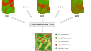
A visualization showing the Performance Zones map for John Doe’s field as computed from relative score images for growing seasons corresponding to 2008-2018. For conciseness, we only show relative scores images for a few years. Positive relative scores are represented as green in these images, with higher positive scores being greener. Negative scores are represented as red, lower scores being redder.
As mentioned previously, we can also summarize the performance zones map using CIBO Stability Score. A stability score represents what fraction of the field that does not have low or varying performance, or equivalently, the fraction of best and average performance. It is between 0 and 100, with higher scores meaning less underperforming or variable performing regions and hence less farming risk. John Doe’s field’s stability score in this case is 72, meaning this field performs reasonably well and has less risk associated with it.
Here we look at a couple of the main challenges we deal with generating a performance zones map, and how we will address them at CIBO. The first challenge relates to the (lack of) data, while the second relates to having more than one management zones.
As I alluded to in the previous sections, remote sensing imagery is not free from problems. To create a performance zones map for a field, we need access to multiple years of good satellite imagery. But satellites such as Landsat have low temporal cadence to begin with – they only pass over a given field once every two weeks or so. There can sometimes exist other issues that make things worse, from something as simple as clouds obstructing the field to something more complicated like satellite malfunctions. An example of the latter is a faulty sensor on Landsat 7 that caused stripes of missing data in many images [4].
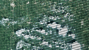
Together these problems can cause long periods when a good image of the field may not be available. In the worst case, this translates to there is not enough data to make a reliable performance zones map for the parcel of land.
One approach to deal with missing information is to make an educated guess of how a VI image for a field would look like for the period where we lack data. With machine learning-based interpolation methods, we can generate realistic images to fill in the gaps in our satellite imagery. In practice, this often works when the gaps are not big in terms of the number of days. We are working to improve its effectiveness and reliability.
The approach we described here to generate a performance zones map – by comparing images across growing seasons – works best if a single crop covers the entire land in the season. It can break down if multiple crops are planted in the same season or if part of the field is not planted. The latter is more likely in locations where water is a scarce resource.
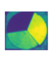
VI image for a Texas field in July 2018. Higher values are shown by greener pixels. There is evidence for multiple management zones here – the sectors in the circle have either different crops or were planted on different dates. The topmost sector appears blue, indicating a VI value of close to zero, perhaps because nothing is planted there.
We already partly address this issue by excluding any regions that we think are not cultivated in that season. For this, we use information from Cropland Data Layer (CDL)[5] – a publicly available crop-specific land-cover dataset – to identify the cultivated region of a field for each year. However, CDL is not 100% accurate, and an error in defining the cultivated region can lead to an unreliable performance zones map. herefore, we are working to build a new solution, using machine learning, that more accurately identifies the cultivated regions of a field for different seasons.
When assessing farmland, it is essential to evaluate the variability and relative performance of different sub-regions. CIBO’s Performance Zones map provides a detailed understanding of historical performance, and CIBO Stability Score can be used to compare different parcels’ performance. Together, these allow anyone to easily and confidently evaluate an unexplored parcel of land in a short amount of time, without spending years operating the field.
1. Landsat – NASA/USGS https://www.usgs.gov/core-science-systems/nli/landsat
2. Sentinel – ESA https://sentinel.esa.int/web/sentinel/home
3. Information about Vegetative Indices, particularly NDVI https://www.usgs.gov/core-science-systems/eros/phenology/science/ndvi-foundation-remote-sensing-phenology
4. Landsat Known Issues: Detector Striping https://www.usgs.gov/core-science-systems/nli/landsat/detector-striping
5. Cropland Data Layer https://data.nal.usda.gov/dataset/cropscape-cropland-data-layer
About Pankaj Bhambhani
Pankaj Bhambhani is a Data Scientist at CIBO, a science-driven software startup. He holds a B.Tech in Information and Communication Technology from Dhirubhai Ambani Institute of Information and Communication Technology and a Masters in Computer Science from the University of Massachusetts Amherst.
Return to the pathway to build your knowledge of regenerative agriculture
Return to Pathway