By Tristrum Tuttle
As a software intern at CIBO technologies, I have spent the last few months working very closely with two open-source Scala libraries CIBO develops and maintains: EvilPlot — a combinator-based visualization library for producing graphs and data displays, and ScalaStan — a Scala wrapper for the bayesian statistics modeling tool Stan. These libraries integrate seamlessly to provide engineers at CIBO profound insights into the data we work with, and we want to help you find profound insights into your data as well! Lets look at a real world example: ranking NBA basketball teams.
I downloaded this 2017–2018 NBA regular season CSV, which lists each game played by each team before playoffs. We are going to rank teams by calculating each team’s skill rating using a Bayesian statistical model built in ScalaStan by fellow CIBOrg, senior data scientist Shane Bussmann.
import com.cibo.scalastan.{RunMethod, ScalaStan}
val model = new Model {
 for (team <- range(1, n)) {
   skillVector(team) ~ stan.normal(divMu(team), sigma = 1)
 }
 for (game <- range(1, m)) {
   val teamA = teamsA(game)
   val teamB = teamsB(game)
   val skillDelta = skillVector(teamA) - skillVector(teamB)
   teamAWon(game) ~ stan.bernoulli_logit(skillDelta)
 }
}
How does this model work? In the words of Shane:
Suppose each team has an inherent true skill level, denoted as “skill.” Consider two teams, Team A and Team B, with skill levels denoted as skillA and skillB, respectively. In our model, what matters is the difference in skill levels, deltaSkill: deltaSkill = skillA — skillB. We use the logit function to convert deltaSkill to p, the probability that Team A beats Team B: p = 1 / (1 + exp(-deltaSkill))
Each of the n teams has an index in skillVector that represents its skill rating. For each of the m games, each team’s skillVector gets updated based on the binary outcome of the game (1 for a win, 0 for a loss). I decide to set the priors for each team [stan.normal(divMu(team), sigma=1)] using a very simple system: If the team made playoffs the previous season, I assume their initial skill (prior) is normally distributed around a divMu of 1.0, and if the team didn’t make the playoffs I assume their initial skill is normally distributed around a divMu of 0.0. My prior distribution assumes that each team that made playoffs the previous year is evenly matched, and is expected to beat a team that didn’t make the playoffs about 73% of the time. This brings us to our first EvilPlot:
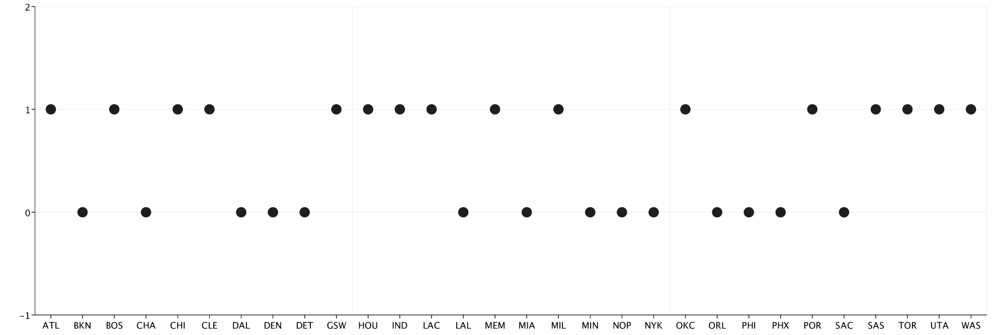
def visualizePriors(priors: Seq[Point]): Unit = {
 val scatter = ScatterPlot(priors)
   .standard(teams.map(_.name))
   .ybounds(-1, 2)
 displayPlot(scatter)
}
If you have never seen EvilPlot in action before, I highly recommend reading about the basics in this article by my mentor, senior data scientist Dave Hahn. The ScatterPlot constructor only needs a Seq[Points], which I build by spacing the priors out evenly. .standard(Seq[String]) adds some basic components to my plot: x/y axis, a grid, and a sequence of labels. I use.ybounds(-1, 2) to shrink the y-axis to a reasonable window. The new displayPlot artifact lets us display our graph in a jFrame, which we can then resize dynamically and save as a PNG.
I run the model with 4 chains and 1000 iterations per chain. In a single line of code, ScalaStan outputs the summary results of the model along with validation metrics for each variable, like R-hat.
val results = model
 .withData(n, 30)
 .withData(divMu, divMuInitial)
 .withData(m, 2460)
 .withData(teamAWon, teamAWonData)
 .withData(teamsA, teamsAData)
 .withData(teamsB, teamsBData)
 .run(chains = 4, method = RunMethod.Sample(1000, 1000))
results.summary(System.out)
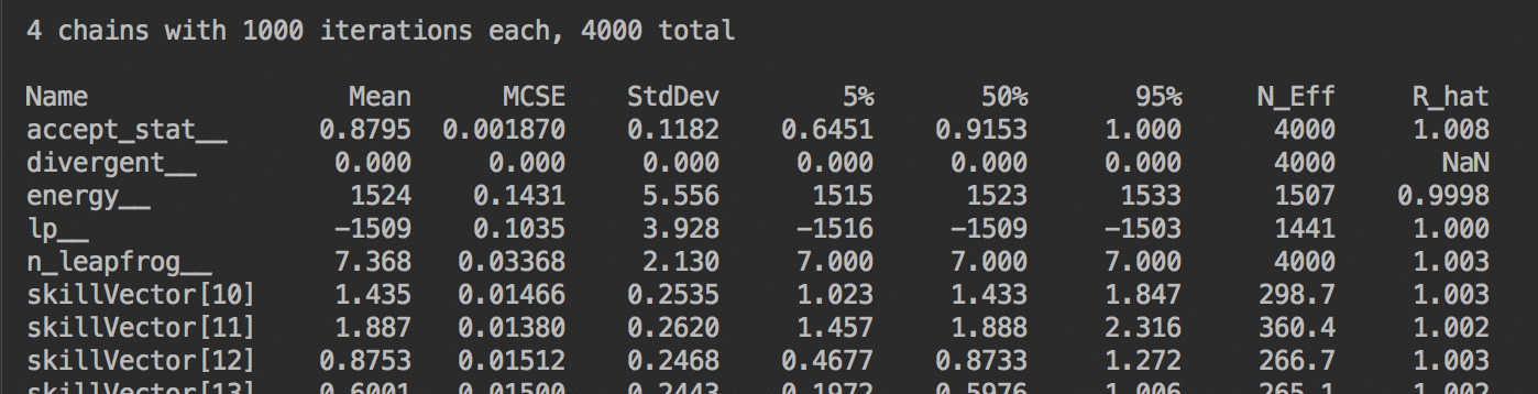
results.summary(System.out) prints summary statistics straight to your console
After validating my model, I want to visualize my results. Luckily, EvilPlot has a Boxplot model that can be used, cough, straight out of the box. In just a few lines of code I can easily display the posterior results from all 4000 iterations of my model:
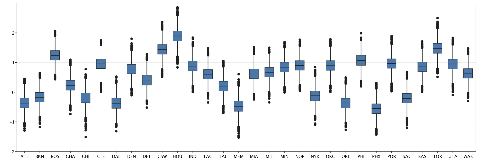
val boxStats: Seq[Seq[Double]] =
 results.samples(skillVector).flatten.transpose
def initialBox(data: Seq[Seq[Double]]): Unit = {
 displayPlot(
   BoxPlot(data)
     .standard(teams.map(_.name))
}
initialBox(boxStats)
This Boxplot does a good job of displaying my immediate results, but we can do better. I decide to sort my results and plot the mean of the posterior for each teams’ skill level with some help from a continuous coloring:
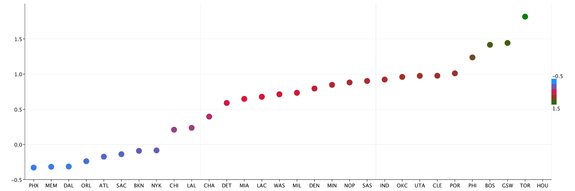
def sortedColoredPlot(results: Seq[Double]): Unit = {
 val colors =
   ContinuousColoring.gradient(Seq(HTMLNamedColors.dodgerBlue,
     HTMLNamedColors.crimson,
     HTMLNamedColors.green),
     Some(-0.5),
     Some(1.8),
     GradientMode.Linear)
 val sortedPairs = results.zip(teams).sortBy(_._1)
 val depthPointRender =
   PointRenderer.depthColor(sortedPairs.map(_._1), Some(colors))
 val scatter = ScatterPlot(sortedPairs.map(_._1).zipWithIndex.map {
   case (y, x) => Point(x - 0.5, y)
 }, Some(depthPointRender))
   .standard(sortedPairs.map(_._2.name))
   .rightLegend()
 displayPlot(scatter)
}
The custom coloring feature in EvilPlot gives me the ability to color points on a continuous spectrum of my own design. In the above plot, I color the plots on a tricolored spectrum from blue to red to green in order to easily identify teams that did exceptionally well or poorly. Some additional highlights:
GradientMode.Linearis one of two built in gradient modes that helps to transform colors into different color spaces- The
PointRenderer.DepthColoris a special point renderer that uses aColoringobject to assign specific colors to different points in a data set rightLegendapplied to theScatterPlotis able to build a legend using our custom renderer automatically and display it on the right hand side of the plot
EvilPlot has several built in tools, like the below StackedBarChart, that make difficult plots easy to render. I decide to grab Elo rankings from the popular stats website FiveThirtyEight, as well as the overall win/loss records of each team, and stack them to get a more diverse view of each teams skill rating. First, I standardize each of the data sets so that I can compare them on the same scale.
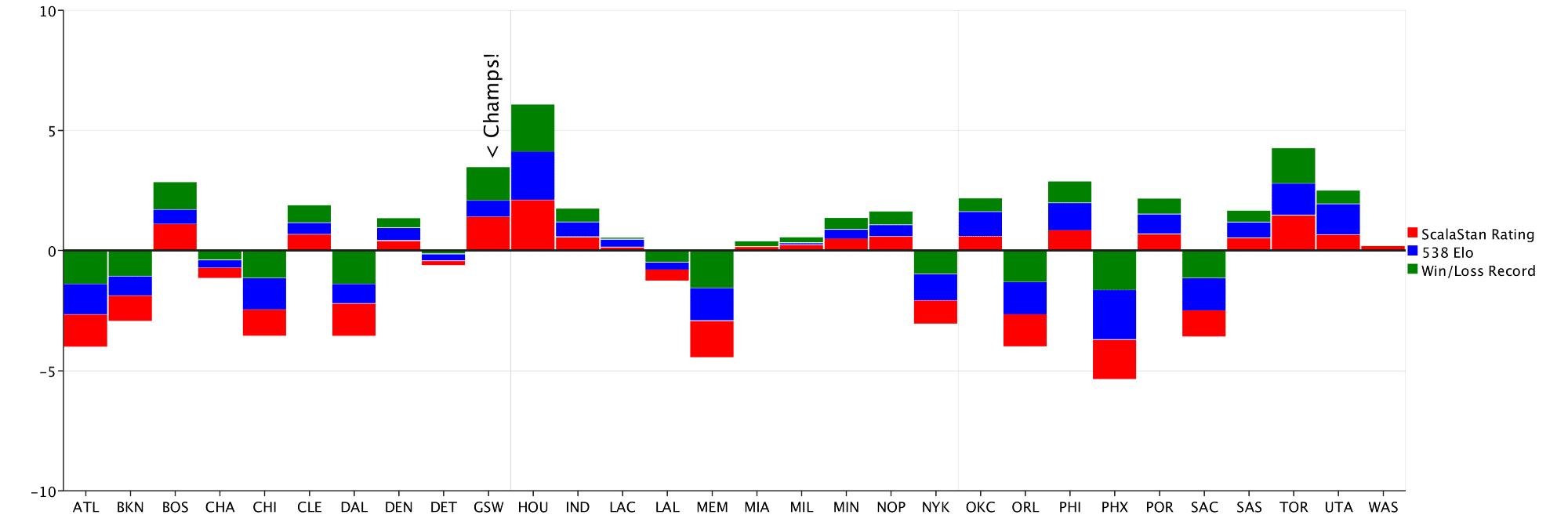
val barChart = BarChart
  .stacked(stackedBars,
    Seq(HTMLNamedColors.red,
        HTMLNamedColors.blue,
        HTMLNamedColors.green),
    Seq("ScalaStan Rating", "538 Elo", "Win/Loss Record"))
  .component(
    Marker(Position.Overlay,
           _ => Text("< Champs!", 20) rotated (-90),
           Extent(20, 20),
           x = 9.5,
           y = 6))
  .standard(teams.map(_.name))
  .rightLegend()
  .hline(0.0)
displayPlot(barChart)
Another new addition to the EvilPlot library, Marker components like the “Champs!” text in the above plot make adding random elements to a plot, well, elementary. EvilPlot has several shape combinators, including rotated , scaled, andcolored that make customization a breeze. The hline(0.0)adds a solid horizontal line at x = 0, helping us pick out teams with positive and negative skill ratings relative to the mean. The BarChart.stacked gives more insight into the true skill rating of each team, but what if one of these rating systems is flawed? I can easily compare each model using ScatterPlotoverlays:
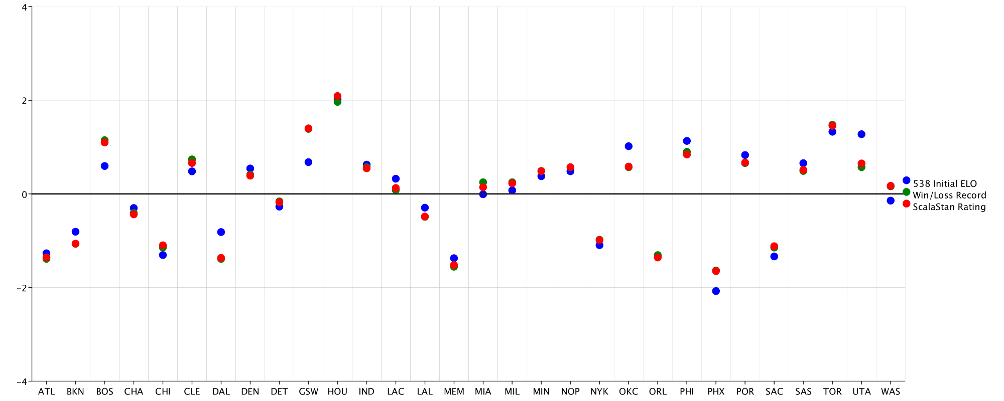
val lines = Overlay(
 ScatterPlot.series(scalaRating, "ScalaStan Rating",
   HTMLNamedColors.red),
 ScatterPlot.series(initialElo, "538 Initial ELO",
   HTMLNamedColors.blue),
 ScatterPlot.series(recordElo, "Win/Loss Record",
   HTMLNamedColors.green)
).standard(teams.map(_.name))
 .xGrid(Some(30))
 .rightLegend()
 .hline(0.0)
displayPlot(lines)
The .series method helps provide some default customization right off the bat, including a label and a color. With each rating plotted, it is clear that the models disagree on the skill ratings of certain teams. To view these differences more clearly, I use the.topPlot component to add a BarChart of the average difference between models for each team:
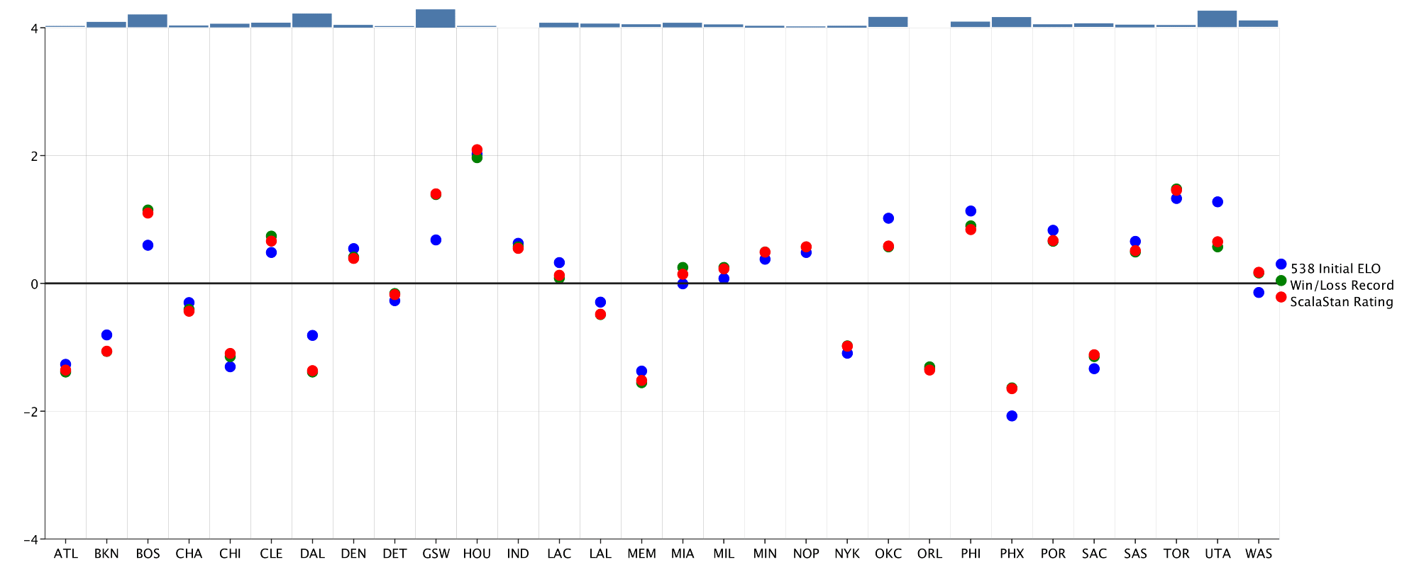
The BarChart looks alright, but I’m not a huge fan of the rectangles as a visualization of magnitude. I decide to create a custom BarRenderer that the BarChart can use instead of defaulting to rectangular bars:
val discRenderer = new BarRenderer {
 def render(plot: Plot, extent: Extent, category: Bar):
   Drawable = {
     Disc(extent.height)
       .transX(extent.width / 2 - extent.height)
       .filled(HTMLNamedColors.grey)
   }
}
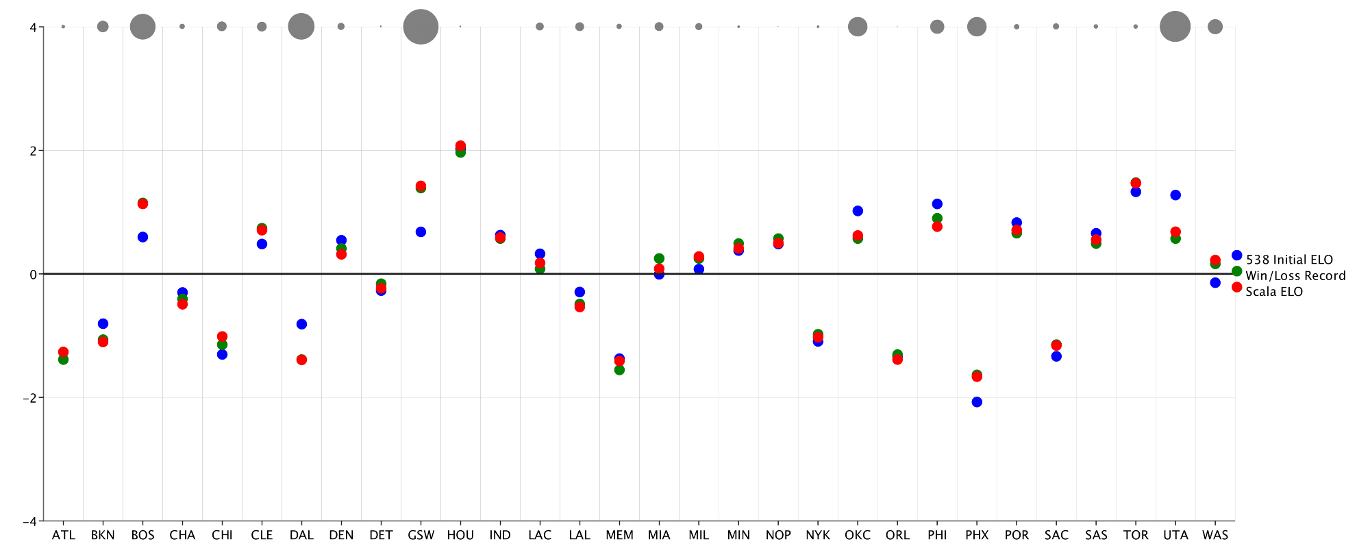
The final product looks much better. Using a customRenderer like the above BarRenderer can bring the most niche design ideas to life. Custom renderers have been built to enable area plots, scatter plots with jitter, and even radial histograms!
I hope that this article convinces you to take a deeper dive into EvilPlot and ScalaStan. When used in tandem, these two tools can really simplify data science tasks in Scala. I want to leave everyone with a few links to help expand on this article and provide more insight into these tools:
- This Github repo contains all the code used to build the model and plots used in this article
- Check out the EvilPlot and ScalaStan docs to learn more!
- Joe Wingbermuehle will be talking about the cool technical guts of ScalaStan at Strange Loop 2018
- Thank you to Shane Bussmann, FiveThirtyEight, and everyone else for the resources used in this article!