News
Plan and Prioritize Your Supply Shed Project with CIBO
January 31, 2023
Imagine that an enterprise with corn in its supply chain wishes to lower the carbon intensity of the corn they source to reduce its Scope 3 emissions and bring them closer to its net-zero target. To manage resources, they must deploy their program to high-priority areas where they know the program will have the most impact.
They’ll need to identify counties they know are within their supply shed, determine which of those have low adoption rates of cover cropping and no-till (and therefore a higher carbon intensity of corn), and incentivize growers in those counties to begin doing these practices. Until now, the options for completing this research to make an informed choice were limited. The company might have a team pour over spreadsheets, soil maps, and yield tables. They might hire a firm to do the research. Or they might just throw a dart at a map and hope to get it right. Arriving at a conclusion could be costly, time-consuming, or carry a high risk of making a poor choice.
But now, with the combination of data science, scaled technology, and innovations like preview modeling, organizations like this can answer all their questions with high confidence in just a few minutes.
Supply Shed Analysis is an advanced feature of CIBO Impact™ that allows companies to get visibility into the carbon footprint, carbon intensity, and adoption rates of regenerative practices within their supply sheds. Using this unique tool, enterprises with agricultural commodities in their supply chain can compare carbon emissions and practice adoption rates between geographic areas. In this post, we explain how companies like the one in our example can use Supply Shed Analysis when planning their Scope 3 emissions reduction projects: geographic targeting.
Using CIBO Supply Shed to Target Areas for Regenerative Ag Programs
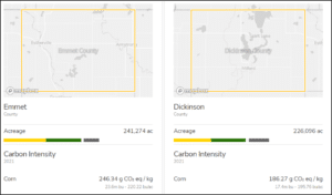
Let’s assume our enterprise has already identified the corn-producing counties within their supply shed. They’re ready to take the next steps of finding and comparing regenerative practice adoption rates and carbon emissions. This analysis is quick and straightforward with CIBO’s Supply Shed Analysis. Users simply select the counties of interest to them using the map-based tool. Instantly, they can view the corn acreage, carbon footprint, carbon intensity, cover crop adoption rate, and breakdown of tillage types.
By selecting multiple counties, it’s easy to compare these statistics side by side and determine where regenerative ag adoption is the lowest. These counties could be prioritized for deploying incentive programs, promoting the most change and, therefore the most impact on the enterprise’s Scope 3 emissions.
In this example, we used counties, but Supply Shed Analysis allows for comparisons across states, watersheds, and custom user-defined boundaries. Users can also compare how practice adoption has changed and impacted carbon emissions over time, as well as estimate how new practice adoption could reduce carbon footprint and intensity going forward. Armed with an understanding of the current state and the future potential for their investment, our enterprise can confidently begin to design and deploy an effective regenerative ag incentive program.

Comparing two Iowa counties: This image shows the carbon intensity of corn for crop year 2021, just one example of the insights provided by Supply Shed Analysis.
Conclusion
Supply Shed Analysis equips users with a rapid understanding of regenerative practice adoption and emissions in defined geographical areas, allowing for easy analysis and comparison. It’s just one feature of CIBO Impact that helps enterprises plan, prioritize and deploy effective regenerative ag programs that reduce Scope 3 emissions. If your enterprise is ready to start using CIBO Impact to create and deploy regenerative ag programs in your supply shed, contact us for a demo.